Category: Free Inquiry

This is the category to apply to your Free Inquiry posts.

Inquiry #3

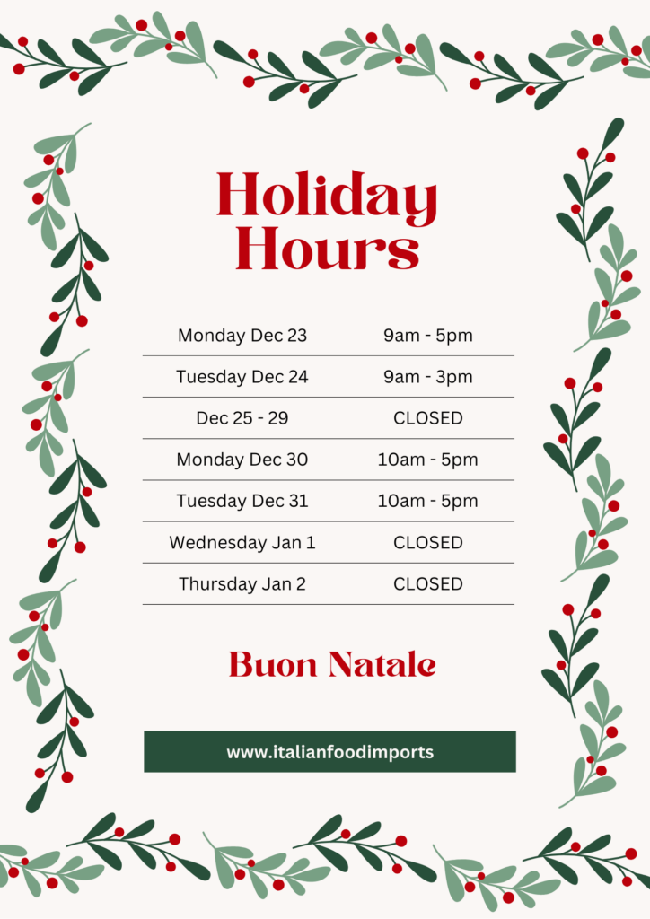
Design and Layout with Canva

The Canva tutorial taught about specific ways to design and layout posters, photos, presentations, etc. They gave 6 steps that you should be following to perfect your projects. First, they talked about proximity. Items that are related to each other are signified by they closeness to one another. When they are not related you would make sure that it is clearly separated to avoid confusion. Second, they touched on the proper use of negative/white space. This is related to proximity, as negative space can be used to separate your non-related items. It also ensures that your work is not cluttered and rather well spaced out. Third, the importance of alignment. The number one tip for this was to ensure that everything is consistent. If you have 3 images going down your page you want to ensure that they are all aligned to avoid them being staggered and looking unprofessional. Fourth, they discussed contrast. You want to ensure that what you want to emphasize is eye catching to the reader. This is done by creating contrast of a title compared to the information. This can be done through a change in colour, font, size, and/or text style. Fifth, repetition is important when presenting a powerpoint or multiple slides. You want to ensure that each follows the same style of text, font size, and colour/theme. Lastly, layout and composition are the most important. This is the building block to your presentation, poster, image, etc. Through the use of all these tips and tricks I was able to create the poster attached below.

Free Inquiry #2

How to Create The Perfect Teacher Production Video That Lands Jobs

A teacher production video will be your opportunity at a first impression. It allows the recruiters to see your personality, something that is difficult to get through a simple resume. It is not only a way to be more personable but can also be a different tool to showcase your skills and credentials. The video should be short and to the point and always made specific to the job that you are applying for. The video demonstration that was given demonstrated a perfect example of the information that is important, but also had a personal touch. Through a video, you are able to show confidence, passion, and language ability. In the video, you should include information such as, you name and where you are from, your educational background (degree(s) and what university you attended), what subjects you teach and any additional coaching or teaching experience that makes you unique, and your style of teaching. This was such an interesting tool to look into that I would not have come across without this class. It provides a whole other perspective on ways to showcase yourself when applying to be a teacher. I will for sure be using this after the program! 

Free Inquiry 1

Death by PowerPoint or Persuasive Presentation

David JP Phillips highlights five principles to make a better PowerPoint and ensure that the students are engaged and retain the information you are presenting. First, he discusses the importance of only putting one message on each slide. This ensures the students are focused on one thing at a time. Second, Phillips discusses the amount of retention that takes place in each individuals working memory. In order for the PowerPoint to be successful you must present short text with one related image if any. This ensures that the audience is able to quickly read what is on the slide and then focus on you talking about the subject. Third, the size of the words is important. Generally, the heading is larger than the rest of the text, but he argues that this should be switched as the text being bigger will draw attention to the importance of it. Fourth, he discusses the importance of contrast within a slide. If you fade the points that have already been discussed or fade all text except for what is important it draws people’s attention to the significant point. He also discusses the importance of a dark background rather than a white one to get the focus away from the slides and onto the speaker. Lastly, he discusses the importance of the number of objects on each slide. Rather than filling up the whole slide and making a shorter PowerPoint he emphasizes that there should be no more than six things on each slide. This does mean that you have to make a larger PowerPoint, but you are keeping the audiences focus throughout. 

Dom McMillian discussed a lot of similar points. He highlighted the importance of short concise slides, writing in point form rather than including full sentences. This backs up Phillips point that the audience will be trying to read all the text rather than listening to the speaker. McMillian also says that less is more, making the text move and having the slides transition in weird ways draws attention away from the information at hand. Through both discussions they emphasize that a PowerPoint should be a background tool that is used for a presentation, not something that provides all information to the audience. 

© 2025 Jaida’s portfolio

Theme by Anders NorenUp ↑