Design and Layout with Canva
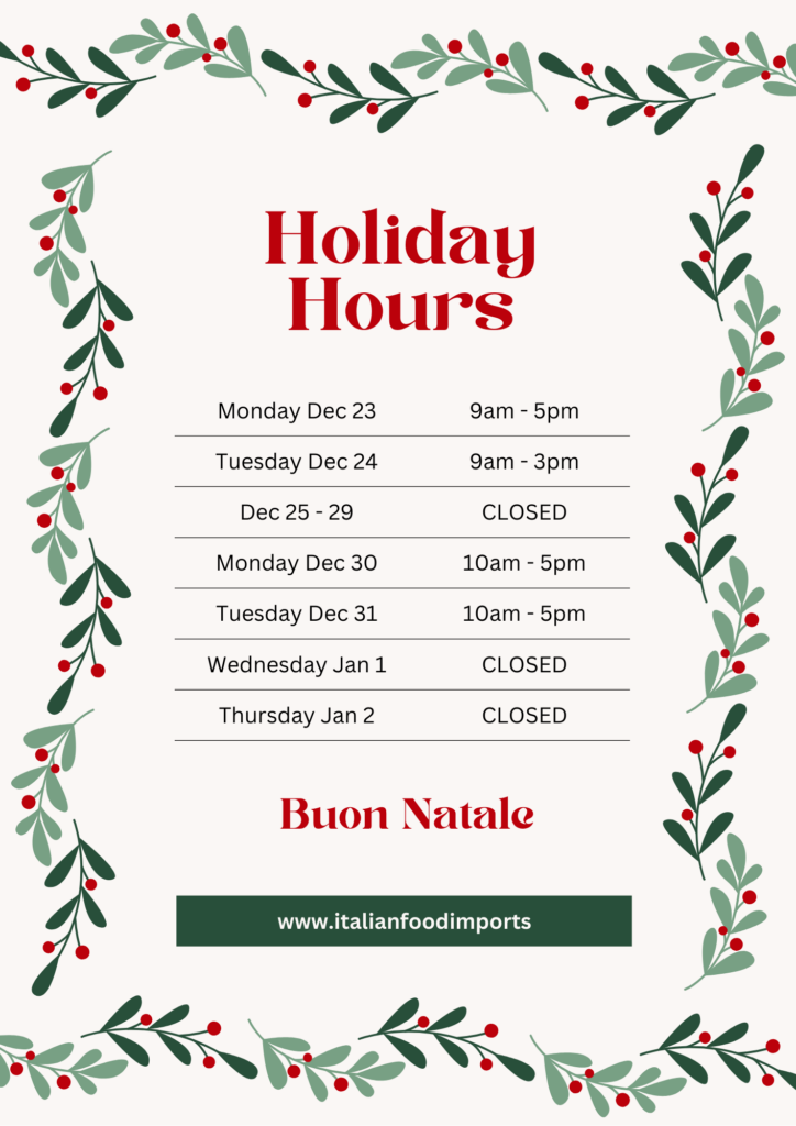
The Canva tutorial taught about specific ways to design and layout posters, photos, presentations, etc. They gave 6 steps that you should be following to perfect your projects. First, they talked about proximity. Items that are related to each other are signified by they closeness to one another. When they are not related you would make sure that it is clearly separated to avoid confusion. Second, they touched on the proper use of negative/white space. This is related to proximity, as negative space can be used to separate your non-related items. It also ensures that your work is not cluttered and rather well spaced out. Third, the importance of alignment. The number one tip for this was to ensure that everything is consistent. If you have 3 images going down your page you want to ensure that they are all aligned to avoid them being staggered and looking unprofessional. Fourth, they discussed contrast. You want to ensure that what you want to emphasize is eye catching to the reader. This is done by creating contrast of a title compared to the information. This can be done through a change in colour, font, size, and/or text style. Fifth, repetition is important when presenting a powerpoint or multiple slides. You want to ensure that each follows the same style of text, font size, and colour/theme. Lastly, layout and composition are the most important. This is the building block to your presentation, poster, image, etc. Through the use of all these tips and tricks I was able to create the poster attached below.
